اگر فایل یا کتابی رو که میخواهید توی سایت نیست روی " پیشنهاد فایل " کلیک کنید.



خرید و دانلود نسخه کامل کتاب Adobe Photoshop Classroom in a Book (2021 release) Kindle Edition
قیمت اصلی 9,269,000 تومان بود.8,814,000 تومانقیمت فعلی 8,814,000 تومان است.

خرید و دانلود نسخه کامل کتاب Autodesk Inventor 2025: Cable and Harness Design (Mixed Units)
قیمت اصلی 16,559,400 تومان بود.16,104,400 تومانقیمت فعلی 16,104,400 تومان است.
📥 ترافیک اینترنت مصرفی جهت دانلود فایلها در میکی بوک، بهصورت نیمبها می باشد.
📥 فقط اینقدر زمان داری با تخفیف بخری 👇
فرصت محدود برای خرید این محصول با قیمت ویژه
08
ساعت
:
45
دقیقه
:
40
ثانیه
-42%
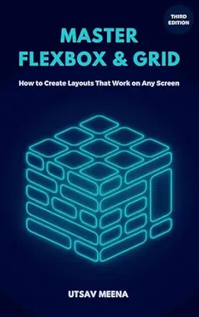
خرید و دانلود نسخه کامل کتاب Master Flexbox & Grid (Third Edition): How to create layouts that work on every screen
قیمت اصلی 1,072,500 تومان بود.617,500 تومانقیمت فعلی 617,500 تومان است.
تعداد فروش: 64
نویسندگان: Utsav Meena
فرمت: Kindle Edition or PDF + Converted PDF تاریخ انتشار نسخه الکترونیکی : July 3, 2025
؟
لینک: https://www.amazon.com/dp/B0FGML1W1P
زمان تحویل: حداکثر 24 ساعت
2
آیتم آخرین فروخته شده 30 دقیقه
5
افرادی که اکنون این محصول را تماشا می کنند!
توضیحات
Master Flexbox & Grid: Build Responsive Layouts with ConfidenceStruggle to lay out your web pages? Tired of guessing how flex or grid properties work? This book gives you a straightforward, visual guide to mastering CSS Flexbox and Grid—without endless theory or bloated explanations.What you’ll get inside:✅ Step-by-step explanations of each Flexbox & Grid property, like flex-direction, grid-template-areas, align-items, and grid-auto-flow✅ Examples broken down into simple, real-world use cases—like navbars, card layouts, and image galleries✅ CodePen links for every concept so you can tweak and see changes live✅ Shorthands and best practices to write cleaner CSS✅ Clear distinctions on when to use Flexbox vs Grid, plus how to combine them effectivelyWho this book is for:Frontend developers who already know basic CSS syntaxAnyone who wants to stop copy-pasting Stack Overflow snippets and start understanding how layouts actually workDesigners and devs who want a practical guide, not a theory-heavy referenceFormats:Available as Kindle ebook for on-the-go reading, paperback for quick desk reference, and hardcover for a durable, professional copy.Note: This edition is streamlined to focus on what matters—hands-on examples and visuals—cutting out low-level browser processing details and math-heavy deep dives.
محصولات مرتبط
-42%
خرید و دانلود نسخه کامل کتاب CHATGPT AI BOOK WRITING FORMULA: Coaches, Therapists : 9 Steps to PROMPT, WRITE, PUBLISH, a Non-Fiction, Client-Attraction Book, 10-100X Faster and Easier, … intelligence (Books for Writers, Authors)
قیمت اصلی 1,072,500 تومان بود.617,500 تومانقیمت فعلی 617,500 تومان است.
-2%
خرید و دانلود نسخه کامل کتاب Real-Time Rendering, Fourth Edition
قیمت اصلی 19,453,200 تومان بود.18,998,200 تومانقیمت فعلی 18,998,200 تومان است.
-18%
خرید و دانلود نسخه کامل کتاب Sketch Your Mind: Nurture a Playful and Creative Brain
قیمت اصلی 2,568,800 تومان بود.2,113,800 تومانقیمت فعلی 2,113,800 تومان است.
-42%
خرید و دانلود نسخه کامل کتاب Write with AI: Conquer Writer’s Block, Unleash Your Creativity, and Write Your Book Using Artificial Intelligence
قیمت اصلی 1,090,700 تومان بود.635,700 تومانقیمت فعلی 635,700 تومان است.
-12%
خرید و دانلود نسخه کامل کتاب Beginning C++ Game Programming: Learn C++ from scratch by building fun games
قیمت اصلی 3,703,700 تومان بود.3,248,700 تومانقیمت فعلی 3,248,700 تومان است.
-12%
خرید و دانلود نسخه کامل کتاب Level Up! The Guide to Great Video Game Design
قیمت اصلی 3,703,700 تومان بود.3,248,700 تومانقیمت فعلی 3,248,700 تومان است.
-12%
خرید و دانلود نسخه کامل کتاب Storytelling with Data: Let’s Practice!
قیمت اصلی 3,703,700 تومان بود.3,248,700 تومانقیمت فعلی 3,248,700 تومان است.
-12%
نقد و بررسیها
هنوز بررسیای ثبت نشده است.